Showing posts with label structural geology. Show all posts

Friday, 18 September 2026

A dial and a circle: two ways of asking a map a question

[Written by Claude, reviewed by myself]

You are standing on an outcrop with a compass in your hand, and the bedding reads 135/35 — a plane dipping thirty-five degrees towards the south-east. Written in a notebook, that is a statement about a square metre of rock. Drawn on a map it becomes a much larger claim: that the same surface will be found there, a kilometre away, on the far side of the valley, under the scree where nobody can go and check.

The distance between those two statements is the whole subject of this post. I put it on this blog on 30 December 2011 as a problem rather than a program, and the answer had two halves which have not changed since. Where the trace of a surface is not mapped, the computed intersection is a hypothesis about where to go and look for it. Where it is mapped, the computation is a test: vary the attitude, and see whether some orientation brings the calculated trace into agreement with the drawn one. Three weeks later there was a program, gSurf, and three weeks after that a QGIS plug-in, qgSurf.

gSurf slept for most of a decade and was rebuilt this year, thanks to the availability of LLM agents, i.e., Claude. It now has two tools, and they answer the same question from opposite ends: one takes a single measurement and extends it across the topography, the other takes a few hundred measurements and asks whether they belong to one folded surface. This post is about what each is for in the field, with the southern Apennines as the test ground throughout. I write attitudes as dip direction/dip, so 135/35 is the plane above, and fold axes as trend/plunge.

One window, one question

gSurf is a small desktop application: one map, one panel of controls, no project file, nothing to configure before you can ask something. It is not a GIS and is not trying to become one. Its single organising idea is that the answer is recomputed on every frame rather than behind a button marked Calculate, so a parameter becomes something you sweep through instead of something you guess, wait for, and guess again.

That sounds like a detail of interface design. It is actually a change in what the tool can tell you, and I will come back to it twice — once for each tool — because in both cases the useful output is not the number on the screen but how much that number can move before the picture stops fitting.

Three projects, and who does what

Behind the application there are two libraries, and the division of labour between them is worth explaining because it is decided by geology rather than by programming taste.

misah is a kernel: about twenty functions written in Rust, compiled, and called from Python. It does the arithmetic that has to run over millions of grid cells — the intersection of a plane with a DEM, among others. I wrote about it last week. geogst is a Python library with no user interface: geometries, orientations, the statistics of a set of measured directions, stereonets, profiles, coordinate systems. gSurf is the hand on the control, and almost nothing else — it opens files, draws a map, and keeps the frame rate up.

Which of the two libraries a tool leans on tells you what kind of question it is asking. Laying a plane on a DEM means visiting every cell of a grid: a million of them per frame, and in pure Python that is 1.7 seconds — fine for one answer, hopeless for a dial. Compiled, the same work takes 22 milliseconds, a factor of about seventy-seven, and that factor is the entire reason the dial exists. Finding a fold axis, by contrast, means taking the statistics of a few dozen directions: 0.4 milliseconds for a window of twenty measurements, 4.2 for three hundred. There is no problem there to solve, so that tool calls geogst directly and no compiled code is involved at all. Writing a faster version of mathematics that already costs less than a millisecond would have bought nothing, and cost a second copy of a formula to keep correct.

Why a second application, next to a plug-in

qgSurf is the one with users. It is on the QGIS plugin repository, it has grown well past the original question — best-fit planes, distances to a plane, stereonets, and since 2022 the cross-section tools of qProf — and it runs inside the GIS where your data are already loaded. If you want to do this on your own project, that is the one to install.

gSurf is where an idea gets tried before it is worth putting in front of those people. The difference is not ambition, it is what each is allowed to risk. gSurf can depend on an alpha kernel whose function signatures still move; it can be rewritten in a weekend; it can throw its whole interface away, because nobody's Tuesday depends on it. A plug-in with users cannot do any of those things, and should not.

What comes back the other way is the reason the arrangement earns its keep. Two examples from this summer, both discovered in gSurf because there the cost of a frame is on the screen while you work. Drawing thousands of short line segments as one broken polyline instead of thousands of separate objects is four to five times cheaper — that lesson went straight into the plug-in, which had been creating one marker per computed point and then walking over all of them at every pan and zoom. And a convenient little helper that reprojects a coordinate pair turned out to be rebuilding the whole projection machinery on each call: on twenty thousand points, 215 milliseconds down to 32. Neither of those is a new algorithm. They are the sort of thing you find when the same calculation has to finish sixty times a second, and not otherwise.

The dial: a plane on a DEM

The first tool lays an unbounded plane — a bedding surface, a fault, a contact, extended forever in its own plane — through a point you choose on the map, and draws the line where it meets the topography. Turn the dial and the trace moves.


Fig. 1. Timpa San Lorenzo, Calabria, on a 5 m DEM with the geological map and the mapped faults underneath. The plane is 135/35 through the yellow point at 758 m; the red line is where it crops out. The dashed rectangle is the window the calculation actually reads. The status bar gives the cost of this frame — 853 points, 5.5 ms of arithmetic, 3.1 ms of drawing — and the grey line under the attitude reads convergence +0.83°, grid 134.2°, which is the subject of a paragraph further down.

There are four things a field geologist can do with that, and they get progressively less obvious.

Predict where to look. You have one good exposure of a contact and a day to find more of it. The trace tells you which spurs it should cross and at what elevation, which is a walking plan.

Test whether a measurement is representative. This is the example I used to introduce the plug-in in February 2012, on a normal fault in the Valnerina, Umbria, from my own mapping. The measured attitude was 227/58, and the trace it produced did not follow the fault as drawn on the map. Turning it to 219/61 did. Neither number is wrong: the first describes the outcrop, the second describes the surface. Eight degrees of dip direction and three of dip separated them — which is about what two people reading the same fault plane will disagree by, and exactly the amount that moves a contact off one ridge and onto the next. I then checked the fitted value the way it was done before any of this software existed, by measuring the separation of the computed trace between contours: 450 m of relief over 245 m of horizontal distance gives a dip of 61.4° against the 61 the program had been given, and a dip direction of about 220 against 219.

See how well constrained the answer is. Here is what the button used to hide. In 2012 I found 219/61 by typing numbers and pressing Calculate; what I could not see was whether 217 or 223 would have done just as well. Sweeping the dial answers that in one gesture: the range over which the trace still follows the mapped contact is the uncertainty of the estimate, read straight off the map. On strongly varied topography that range is a couple of degrees. On a planar hillside it is enormous — every plane through that slope produces much the same line — and watching it happen is a better lesson in ill-conditioned problems than any amount of being told.

Project a horizon that is not at the surface. The three coordinates of the source point are independent, so you can lift it off the ground and keep it there while you drag it around the map. That is how you lay a plane on a marker horizon that passes a hundred metres above today's topography, or below it.

Two traps, both geological rather than computational. The first is that the two norths do not agree. You measure dip direction against true north, once declination is corrected; the DEM lives on a projection's grid, and grid north points somewhere else. In the southern Apennines on EPSG:25833 the meridian convergence runs between +0.41° and +1.04°, which over five kilometres of trace is up to 91 metres — twenty DEM cells, small enough to look like a mapping error and large enough to make you doubt a perfectly good measurement. gSurf reads and writes true azimuth, as the compass gives it, subtracts the convergence before computing, and shows you both numbers. The second is that the DEM is never loaded into memory: the background is a coarse overview and the calculation reads one full-resolution window at a time. A 234-megapixel mosaic therefore costs the same per frame as a small crop, where loading it in the obvious way would have been 2.5 GB.

The cost of a frame, on that mosaic, dragging the dial:

windowms per frameframes per second
500² cells (2.5 km)10.992
1000² cells (5 km)26.638
2000² cells (10 km)95.711

Real time holds to five kilometres of window and no further. Beyond that the arithmetic alone eats the frame, and the honest thing is to say so rather than to let the dial feel sticky.

The circle: fold axes under a moving window

The second tool starts from the other end: not one measurement, but every bedding attitude on a map sheet. Drag a circle across the map, and it reports what the measurements inside that circle have in common.

The reasoning is the classical π-diagram, and it is worth stating carefully because everything the tool does follows from it. Plot the pole of each bedding plane — the direction perpendicular to it — on a stereonet. If the beds inside the circle are folded about a single line, then every bed contains that line, so every pole is perpendicular to it, and the poles fall on a great circle (a girdle). The pole of that girdle is the fold axis. If instead the beds all dip much the same way — a homocline — the poles fall in a tight cluster, and there is no fold axis to report at all.


Fig. 2. The circle at 590000/4500000 on the Potenza–Irsina sheet, radius 2 km, with 38 bedding attitudes inside it (red) out of those on the map (black). The net follows the circle as you drag it — poles as dots, the best-fit girdle dashed, and its pole, the fold axis, as the red diamond: 312/13, with K = 0.59. It normally floats over the map and is docked here to fit in one picture. The status bar times the frame you are looking at: 0.46 ms to find the attitudes inside the circle, 1.3 ms for the statistics, 5.4 ms to draw both pictures.

Telling those two cases apart is not a matter of judgement, and it is the one piece of statistics in this post. Woodcock's K compares how elongate the set of poles is with how flattened it is: below 1 the poles form a girdle and there is a fold; above 1 they cluster and there is not. C says how strongly oriented they are at all, as against scattered. gSurf refuses to call anything a fold axis unless K is at most 1, C is at least 1, and there are at least ten measurements — and you can move all three thresholds while you work.

The refusal matters more than it sounds. In a cluster, the direction the tool would report as an axis is the direction with the fewest poles, which is the worst-determined direction in the data rather than a structure. It will happily produce a number. On the 1757 usable attitudes of the Potenza–Irsina sheet, three windows in four fail that test, and taking the sheet as a whole gives K = 1.28 — that is, over most of that map the bedding is homoclinal, and an axis computed there means nothing. A refused axis is drawn in grey rather than hidden, because hiding it would answer "is this a fold?" with a blank screen, which reads the same as no data; greyed, you watch it turn colour as the circle crosses a real hinge.

The radius is the interesting control. Read the same place at three sizes and you see what the window is for.

Fig. 3. One locality, three radii, the same ground each time. At 1 km there are ten attitudes, they cluster (K = 1.16), and the axis is refused — drawn grey on the net rather than hidden. At 2 km, 38 attitudes give 312/13 with K = 0.59. At 5 km, 162 attitudes give 312/19. An axis that survives a change of scale is a structure; one that does not is a coincidence.

The radius is also a decision about the data, not only about the geology. On Monte Alpi the survey is thin — 0.69 measurements per square kilometre against 1.10 on the Val d'Agri sheet to the north — and the median window at 2 km holds seven attitudes where at 3 km it holds eighteen. Below ten the tool refuses, so on that massif the choice is 3 km or nothing, and you should know that you are making it. In the Pollino massif the question cannot be asked at all: sheet 534 Castrovillari was never published, and Monte Pollino has no bedding measurement within ten kilometres of it. The tool has nothing to say there, and says so.

Asking everywhere at once

Dragging a circle by hand answers one question at a time. The same window can be laid down at every node of a square grid instead, which turns a sheet of scattered measurements into a map of fold axes — drawn only where the test is passed, and coloured by plunge, because a tick mark can carry the trend in the direction it points but not the plunge in its length, and the plunge is half of what an axis is.

Fig. 4. Left: 1835 fold axes over two adjacent 1:25,000 sheets — one tick for every 500 m cell whose window passed the test, out of 6270 cells that held data, coloured by plunge. The grey dots are the bedding stations; the blank ground between the patches is where the poles clustered instead of forming a girdle. Right: those same axes as trend against northing (grey), with their mean per kilometre of northing in red. The mean turns by fourteen degrees across the dashed line — and the dashed line is not a structure. It is where one map sheet ends and the next begins.

This is where a tool has to be honest about what it is doing, because a picture of a thousand ticks is extremely persuasive. Three things are worth knowing before believing one.

A step in the data is not a step in the rocks. Averaged over the six kilometres on either side, the axes of the two sheets above trend 157° and 138° — nineteen degrees apart, which one would happily interpret as a structural boundary. Before interpreting it as anything, it is worth asking what the same measurement does across a line that means nothing: cut the field at parallels every 250 m inside a single sheet, and compare three kilometres above each cut with three below. Eighty-four such lines give a median step of 3° and a largest of 10°. The sheet edge gives 21°, and the six-kilometre and one-kilometre versions of the test agree. So the step is real, and it falls on an administrative line — but what put it there is still open, and the obvious answer is the wrong one. A change of recording convention can be ruled out: both sheets give azimuth to the degree and dip to five, in much the same proportions, and rewriting a sheet's attitudes to the coarser convention shifts the computed trend by 0.7° in the median. Whatever the two campaigns did differently, they did not do it with their notebooks. What is left is which outcrops were visited and which surfaces were called bedding — and neither is recoverable from the delivered map, which is the uncomfortable part. What makes the question askable at all is merging the two sheets into one layer: asked inside either one, no test can see it.

Overlapping windows are not independent observations. A circle of radius R laid down every S metres covers πR²/S² cells, which at R = 2 km and S = 500 m is about fifty. Every attitude is therefore counted in fifty windows, and neighbouring ticks share nine tenths of their data. A field of a thousand axes looks like a thousand observations and carries about fifty windows' worth of information. The tool prints both numbers under the spacing box — each attitude in ~50 cells; ~50 windows would tile the area — because the ratio between the two controls is never something you set on purpose, and the count of axes is what gets quoted. A finer spacing buys resolution in the picture and no further information underneath it.

The threshold is a choice, and it shows. Because the field is kept as numbers rather than as a picture, moving the K threshold re-decides the entire map in three to seven milliseconds without recomputing anything. Sweeping it from 0.5 to 2.5 takes the same sheet from 369 axes to 2049, out of 3556 cells that hold data. How much of a map depends on where you put a threshold is not a question you can answer by running the calculation four times over a coffee break — but it is one you can answer by dragging a slider, and then it is not a question you can avoid. The exported grid carries the thresholds along with the verdict for every cell, because an answer recorded without the choice that produced it cannot be checked afterwards.

Building the field is the slowest thing either tool does, and even that is not slow: 4140 cells in 2.6 seconds, 16289 in 9.6. Dragging the circle by hand costs 4.5 milliseconds a frame, of which the search for the attitudes inside it is 0.1 and the statistics 0.8; the rest is drawing two pictures.

What the field of axes does not tell you

One result from this summer's work in the southern Apennines belongs here, because it is the sort of thing a tool should be used to find out about itself.

On two sheets in northern Calabria there are 94 fold axes measured directly at outcrop — someone stood at the hinge and read the line. Computed axes are available at the same places from the bedding attitudes on the same sheets, so the two can be compared, and I expected the measured ones to serve as a yardstick. They do not agree: the median difference in trend is 34° to 44°. What does agree is the plunge — 15.0° against 15.2° — and the computed field is internally consistent, in that neighbouring nodes differ from each other by about four degrees. So this is not noise, and it is not a coding error either.

The most likely reading is that the two are not measuring the same thing. A 2 km window pools bedding across whatever is inside it and returns the geometry that best describes the pool, which in an area folded more than once is not necessarily the generation whose hinge you were standing on. The conclusion I draw for the tool is narrow and useful: in that area the absolute computed axes should not be trusted, while the way the field changes from place to place still can be. A window is a scale of observation, and an answer returned at one scale is not a claim about all of them.

What the two tools have in common

They look different — a dial and a circle, one measurement and four hundred — and they are the same idea twice. Both take something whose validity depends on a scale, and put that scale in your hand. Both are built so that the control can be moved continuously, because the answer that matters is the behaviour of the number and not the number. And both are willing to say nothing: a trace that fits over a forty-degree range of attitudes, an axis drawn in grey because the poles do not form a girdle. A tool that always produces an answer is not being helpful.

Getting it

gSurf is at gitlab.com/mauroalberti/gSurf, GPL-3, Python 3.9 or later:

pip install misah numpy rasterio PyQt6 matplotlib pyproj
pip install geogst mplstereonet geopandas shapely   # for the fold axes
python -m gsurf

It opens on the two tools and asks for nothing until you have picked one; then it asks only for what that tool needs — the plane wants a DEM, the fold axes want a layer of attitudes and the two columns its angles are in, and neither is asked for the other's.

It is alpha and the word is meant. Two things from the older version are worth having back and are not in it yet: topographic profiles with attitudes projected onto them, and the fault-and-slickenline stereonet that reads a rake and a sense of movement. If you want these analyses on data you already have loaded, the plug-in — qgSurf — is the place to start, and it is where whatever survives its trial here will eventually turn up.

The trail on this blog

Modified: 2026-09-18 H 14:32


Wednesday, 9 September 2026

Misah

Given an attitude measured at an outcrop, where must that plane cross the topography? That calculation has been rewritten several times. It is now a compiled kernel called misah, written mostly by Claude (as is this post), and as of this week it is installable:

pip install misah

What it is, and what it is not

misah is not an application. There is no window, no menu and no project file. It is a library of about twenty functions that take arrays of numbers and return arrays of numbers — written in Rust, compiled, and called from Python as if it were an ordinary module. You give it a DEM and a plane and it gives you back the trace. You give it faults and slickenlines and it gives you back a stress tensor.

The reason it is compiled is speed, and the reason speed matters is not impatience. A calculation that takes two seconds is something you run when you have decided what to ask. A calculation that takes five milliseconds is something you can put on a dial and turn, and turning a dial is a different way of thinking about a problem — you can sweep dip direction through forty degrees and watch the trace walk across the valley, rather than guessing a value, waiting, and guessing again. The last section of this post is about what that looks like.

Nothing here is a new algorithm. Most of it is a port of code I have written before and checked against for years: the plane–DEM intersection and the best-fit plane come from geoSurfDEM, the forward stress problem from a Fortran program of mine called ForwardStress.f95, the 3D density from InterpDensity3D, and the mechanism rotations from Kagan (1991), against the table printed in that paper. The tests do not check that the new code runs. They check that it agrees with the old code, number for number.

Where does that plane crop out?

This is the original question, and it is still the one I use misah for most. An unbounded plane, an outcrop point it passes through, a DEM, and the answer is the set of chords where the two surfaces meet.


Fig. 1. One outcrop at 1527 m on Monte Alpi, southern Apennines, and the same plane at three attitudes on an ASTER DEM at 27 m. Red is 135/35; blue is the same dip direction ten degrees steeper; green is fifteen degrees round in dip direction. All three pass through the same point, and by the northern edge of the map they are more than a kilometre apart. This is why an attitude measured at one outcrop is a hypothesis about the map and not a description of it.

Look at how far the three traces separate. That is the whole argument for doing this rather than sketching it: ten degrees of dip is well inside what two people reading the same fault plane will disagree about, and by the far side of the map it has moved the contact off one ridge and onto another. In the Valnerina case the difference between 227/58 and 219/61 was eight degrees and three degrees — and it was the difference between a trace that followed the mapped fault and one that did not.

Stress, forwards and backwards

The Wallace–Bott hypothesis says slip on a fault happens in the direction of the resolved shear stress on it. Run forwards, that predicts the slickenline a given stress tensor would leave on a given plane. Run backwards, it recovers the tensor from a population of faults with their slip.


Fig. 2. Left: eight fault planes of assorted strike and dip, and the slickenlines that an Andersonian normal tensor (S1 vertical, Φ = 0.5) would drive on each. Right: those faults handed back to the inversion with the tensor removed. Circles are the true axes, stars the recovered ones; they coincide. The search visited 71,280 candidate tensors and the mean misfit at the winner is 0.00°.

The search is exhaustive rather than a descent, and that is a deliberate choice with a geological reason. A fault population carrying two superposed tectonic phases has two minima by construction. A descent finds whichever one it falls into and reports it with no hint that the other exists. Walking the whole grid costs more and tells you when your data are of two minds — the function returns the runners-up as well as the winner, so a minimum standing alone can be told from one sitting on a plateau.

Two things it insists on, both of which have cost me data in the past. A slickenline that does not lie in the plane it was recorded on is refused by name rather than inverted: that is not a fault with a small error, it is two compass readings that do not belong to each other. And where the sense of movement was never determined, you say so — a fault whose sense nobody could read is scored modulo 180°, instead of being scored at 180° for being right.

Density without bins

Counting hypocentres in boxes has two problems that everyone knows about and nobody can fix: you choose the box size by hand, and the answer changes when you move the boxes. A kernel estimate removes both.


Fig. 3. 420 synthetic epicentres and their density at 900 m bandwidth. The field is in events per km², not in arbitrary units: summed over the grid and multiplied by the cell area it comes back to 420.0 of the 420 events that went in. That is what makes two runs at different bandwidths comparable with each other.

The bandwidth is in map units and there is one per axis, which matters more than it sounds. Depth is not interchangeable with easting even when both are in metres: a seismogenic layer is far wider than it is thick, and a single isotropic bandwidth over one will mix its top with its bottom before it mixes two neighbours. The same machinery runs in one dimension too, where a histogram of hypocentral depths becomes a smooth curve with no bin edges to argue about.

Over the same grid you can put a stress inversion at every node instead — Hardebeck and Michael's (2006) spatially varying inversion, in kernel form: each fault contributes to every node it can reach, weighted by distance, rather than the dataset being cut into bins and neighbouring solutions damped towards each other. Every node also reports how much data actually reached it, which is the number that says whether the tensor there is worth reading.

Turning the dial: gSurf

gSurf is the 2012 application, rebuilt this year around the misah kernel. It does one thing: it lays an unbounded plane on a DEM and recomputes the intersection on every frame, while you turn a dial.

Fig. 5. gSurf on Monte Alpi region, with the geological map and the mapped faults underneath. Dial for dip direction, slider for dip angle, and the red trace follows as you turn them. The status bar at the bottom reports the cost of every frame: 853 points, 5.5 ms in the kernel, 3.1 ms drawing. Note the line under the attitude — convergence +0.83°, grid 134.2°.

That last detail is worth a paragraph of its own, because it is the kind of thing that quietly ruins a result. You measure dip direction against true north. The DEM lives on a projection's grid, and grid north is not true north. In the southern Apennines the meridian convergence runs between +0.41° and +1.04°, which over five kilometres of trace is up to 91 metres of displacement — small enough to look like a mapping error and large enough to make you doubt a perfectly good measurement. gSurf reads and writes true azimuth, as it is measured in the field, and subtracts the convergence before calling the kernel.

The DEM is never loaded into memory, so it can be as large as you like: the background is a decimated overview and the kernel runs on a full-resolution window centred on the source point. You can drop the point anywhere on the map, lay the plane on a horizon that passes above today's topography, and export the trace as a shapefile when it fits.

Getting it

misah is at version 0.2.0-alpha.2, on PyPI and on crates.io, GPL-3.0-or-later, and needs Python 3.9 or later:

pip install misah

There are wheels for Linux (x86-64 and ARM64), macOS (universal2) and Windows, so there is nothing to compile unless you want to. The source is at gitlab.com/mauroalberti/misah, with three worked notebooks under docs/notebooks that generate their own data through the forward model — so what the inversion ought to return is known without trusting the inversion. gSurf is at gitlab.com/mauroalberti/gSurf.

It is an alpha and the version number means it: the function signatures can still move. What will not move is the arithmetic, which is older than any of the code it currently lives in.


Monday, 5 January 2026

Building geological cross-sections with GeoProfiler: simpler and more flexible

[Thanks to chatGPT for helping]

The GeoProfiler module in qgSurf is an attempt to make geological profile creation workflow less painful and more reproducible. GeoProfiler is built around a three-step workflow:
  1.    (optional) Create (or reuse) a 3D topographic profile layer 
  2.    Tell GeoProfiler which 3D profile layer you want to work on
  3.    Add geological data and generate a configurable plot
Steps 1 and 3 are the “real work”. Step 2 is the glue: a small but crucial step where you just define the working 3D line layer.

What makes GeoProfiler really useful, especially from a field-geologist’s point of view, is that it allows you to think in terms of geological problems, not in terms of software tools.

Very often, when we build a cross-section, the hardest part is not drawing the line — it is deciding how the terrain should be cut in order to see something meaningful. Sometimes we want a single clean section, sometimes we want to see how the same structures evolve a few hundred meters to the left and to the right.

With GeoProfiler, this becomes natural. You can create a single topographic section, when you just need one good line across your structure — or a small set of parallel sections, when you want to compare how things change laterally. This is especially helpful for understanding the geometry of thrust systems, fold trains, or fault zones that widen or branch with distance. Instead of repeating the work five times, you simply define one baseline and let the tool generate parallel profiles around it.

Another big step forward is that profiles are no longer forced to be straight lines.
In earlier tools, the section had to be rigid: point A to point B, perfectly linear. But that is rarely how we actually think in the field. Sometimes the most meaningful section follows a valley floor, bends around a ridge, or gently curves to intersect key geological features. GeoProfiler allows those curved (but still geologically reasonable) sections, so the resulting profiles feel closer to the way we would sketch them in a notebook.

A third aspect that matters a lot in real projects is that our datasets almost never “fit” each other perfectly.
A DEM from one source, vector geology from another source, structural stations collected with yet another coordinate system. GeoProfiler is designed to work across different map projections, handling the transformations internally so that everything is brought consistently onto the profile. Instead of fighting with reprojections and fear of small misalignments, you can focus on what each dataset is telling you.

Once the profile (or profiles) exist, the geological part becomes straightforward: you can start adding what you would normally reason about in a cross-section — fault traces intersecting the terrain, lithological units cutting across the line, scattered point data such as measurements or events, or structural attitudes that define planes dipping into or out of the section. Bit by bit, the profile becomes not just a topographic cut, but a genuine geological interpretation space.

The detailed technical options are all documented in the help — the intention here is simpler: GeoProfiler tries to reduce the friction between thinking like a geologist and working inside a GIS. It gives you sections that behave more like the ones we sketch in the field, while still being reproducible, measurable, and connected to real data.


Modifications:

2026-01-06: added hyperlink to qgSurf plugin repository 


Friday, 4 October 2024

Segments in Mojo

After implementing points in Mojo, with some assistance from ChatGPT and Phind, we now turn our attention to segments, which represent the next fundamental geometric structure preceding polylines (or simply lines).

A segment consists of a start point and an end point, rendering it an oriented entity. It is implemented as a Mojo structure, that implements a few methods, such as returning the segment start and end points, calculating the total or horizontal lenght, and so on.

To facilitate point copying when returning a segment's start or end point (via the start_point and end_point methods), the __copyinit__ method was introduced to the Point structure: 

  fn __copyinit__(inout self, existing: Point): self.coords = existing.coords 

 This method allows for efficient copying of point coordinates, which is crucial when working with segments. 

Moving on to the Segment structure, apart from incorporating several basic methods (such as dx, midx, length, horizontal_length, and others), two significant methods were added for calculating the azimuth and plunge of a Segment instance. These concepts are extensively utilized in geological contexts. 

The azimuth refers to the angle, within the horizontal plane, between the horizontal projection of the segment and the Y-axis. This angle is measured clockwise, commencing from the Y-axis, spanning from 0° to 360°. 

The plunge represents the dip of the segment in the vertical plane. It signifies the vertical angle between the horizontal plane and the segment. Its range extends from -90° to +90°, where positive values denote a downward dip, and negative values signify an upward dip. 

Both azimuth and plunge are expressed as Float64 values, but their values may remain undefined under specific circumstances. The azimuth becomes undefined when the segment is vertical or possesses zero length (i.e., when the start and end points coincide). Similarly, the plunge remains undefined when the segment's length is zero. 

To address these edge cases, both the azimuth() and plunge() methods return an Optional[Float64], with Optional being imported from the standard library's collections module. If the value is invalid, None is returned; otherwise, the valid value is returned. 

Notably, the valid return can also be encapsulated into an Optional — both approaches are considered valid. When presenting the result, the value must be extracted using the or_else method, where the input to this method serves as a placeholder for missing data. 

In the example code, a conventional no-data value frequently employed in Geographic Information Systems (GIS) was utilized by defining an alias: 

   alias NULL_ORIENTATION = -999999999.99999 

 This alias is subsequently applied as follows:

   print("Segment plunge:", segment.plunge().or_else(NULL_ORIENTATION)) 

In this scenario, when the result is valid, it will be printed; conversely, if the result is invalid, the no-data value defined in NULL_ORIENTATION will be displayed. 

By implementing these features, the Segment structure becomes more robust and versatile, capable of handling various geometric calculations essential in geological applications and beyond. 


The code is available at: https://gitlab.com/mauroalberti/kira


Monday, 26 August 2024

geogst, a new Python module for Structural Geology


geogst is a new Python module for structural geology available on PyPi, making it easily installable via the classic command pip install geogst (or python -m pip install geogst).

This module was primarily developed to facilitate the creation of stereonets for geological data, determining the intersection between geological planes and topographic surfaces (expressed through Digital Elevation Models, DEMs), and generating the skeletons of geological profiles. Among its main features, the module allows for the calculation of topographic profiles, adding geological attitudes, and determining the intersections of geological traces with these profiles.


Additionally, geogst includes example geospatial datasets that can be used to explore its functionalities, such as creating profiles directly within Jupyter Notebooks.

Here are a few examples of Jupyter Notebooks for creating geological profiles:

This module will form the foundation for the modules in the qgSurf plugin for QGIS. Currently, qgSurf directly includes geogst as a submodule, so no separate installation is required. In future versions of qgSurf (initially experimental), the geogst module will be automatically installed if it is not already present.

Since QGIS does not allow the upload of compiled code in Python modules, a key advantage of using geogst as a separate module in qgSurf is the potential to incorporate compiled code in Fortran, C++, and Rust, significantly improving the speed and efficiency of these tools.

Conclusion and call to action: If you are a geologist or a developer working with geological data, we invite you to explore geogst and contribute to its development. Your experiences and feedback are crucial to improving and growing the community that uses ggSurf.

Monday, 26 December 2022

Along-trace profiles of the Timpa San Lorenzo fault structure (Calabria, Italy)


Fig. 1. 3D view of the Timpa di San Lorenzo structure (center) with the Pollino range at the West (left). View from NE, Google Earth maps.


One quite spectacular geological structure in Southern Italy that can be visualized in 3D terrain browsers such as Google Earth is the Timpa di San Lorenzo (TSL) carbonatic structure, outcropping at the border between Basilicata and Calabria near San Lorenzo Bellizzi (Fig. 1).  

If you play for instance with Google Earth, you would note a well exposed, planar fault surface cutting through limestones in the footwall. This fault is dissected by other faults, the main one being a NW-SE high-angle fault. North of it the TSL fault has a WNW-ESE trend, while to the South it is NNW-SSE (Fig. 2).
 
   
Fig. 2. Geological sketch representing the Timpa di San Lorenzo structure (center), subdivided into two segments by a NW-SE trending fault. The Mt. Pollino range is at the West (left).

In Alberti (2019) the two main segments were analyzed with GIS tools, namely the qgSurf plugin for QGIS, in order to derive the best-fitting planes to the various fault segments.
For the northern segment the geological plane fitting the traces has an attitude of 072°/39° (dip direction/dip angle), i.e., a medium-angle fault dipping to the ENE.
In the southern segment the best-fitting plane attitude is 082°/40°, i.e. a 10° trend rotation in a clockwise manner with respect to the northern sector.
 
In order to help visualize these inferred geological planes directly within geological profiles, I am adding in the pygsf and gst Python modules a new GIS tool that uses line traces with attitudes, intersect them with profiles and plot the intersected attitude in the profiles. This tool is still in development.
 
To analyse the geological situation for the studied zone, I used the two previous geological attitudes in order to derive, using the ‘Plane-DEM intersections’ tool of the QGIS  qgSurf plugin, their expected topographic traces. These line traces were clipped to the appropriate spatial domain and then merged together into a single line shapefile.

Using pygsf, gst and spatdata modules in development mode within Jupyter Notebook, the Timpa di San Lorenzo data were imported from the spatdata module, maps with faults (both mapped and theoretical traces) and profiles traces were created (Fig. 3).


Fig. 3. Geological plane traces approximating the Timpa di San Lorenzo structure (yellow lines), with numbered traces of parallel profiles. Profiles from 1 to 7 are of the fault northern segment, from 8 to 13 from the southern one.

The final product is represented by the geological profiles (Fig. 4), always produced within Jupyter Notebook using the three mentioned modules. The produced profiles highlights the carbonatic structures, while the pelagic sediments and meta-sediments units are not mapped.

As you can see in the profiles, the theoretical planes approximate quite well the attitude of the outcropping TSL fault slickensides (profiles 1 to 8, with the exception of profile 3, where the TSL fault is masked by other  units).

In the southern segment, the slickenside is visible mainly in profile 8 and also profile 9.
Moving soutwards, both the fault slickenside and the footwall is more and more eroded, due to the deep incision of the Torrente Raganello (profiles 10-13).

Fig. 4. Parallel profiles of the Timpa di San Lorenzo structure (yellow lines), with fault intersections (red dots), geological outcrops of limestones (PL, green) and the profile trace of the best-fitting geological planes (yellow bars). Profiles from 1 to 7 are of the fault northern segment, from 8 to 13 from the southern one. Additional outcrops are of Quaternary sediments (Qt), Albidona Formation (Al) and Saraceno Formation (Sa).

 
The Jupyter Notebook document used to create these (and more) analyses is available here.
 
To replicate the analysis you have to clone the gsf, gst and spatdata repositories, install the modules (for instance in development mode) and then run the notebook.


References
 
Alberti M. 2019. GIS analysis of geological surfaces orientations: the qgSurf plugin for QGIS. PeerJ Preprints 7:e27694v1 https://doi.org/10.7287/peerj.preprints.27694v1


Saturday, 17 December 2022

GIS evidences for low-angle segments in the Valnerina fault system (Central Apennines, Italy)

A long time ago, my PhD thesis was about the Valnerina line, a Cenozoic structural lineament in the Central Apennines of Italy, that runs parallel to the more important Olevano-Antrodoco line (Fig. 1), that is considered by many Authors to have played an major syn-sedimentary role during the Mesozoic pre-orogenic phase. The Valnerina line was investigated, among others, by Francesco Antonio Decandia (e.g., Decandia 1982), my thesis supervisor in Siena University. 

During the Cenozoic compression phase, both the Valnerina and the Olevano-Antrodoco lines would have been acted as oblique-dextral ramps in the Apenninic thrust-and-fold belt. This role would have derived from the reactivation of syn-sedimentary faults of the Mesozoic Umbrian basin (Decandia, 1982). 

Fig. 1. Map of the described zone. From Fig. 9 in Alberti, 2006.

I remember, in a field trip with students, that Decandia showed us a large fault slickenside between Jurassic Calcari Diasprini/Calcari a Posydonia and Cenozoic Scaglia tectonites in the Schioppo segment of the line. The slickenside was quite high angle, dipping 70° or more to the West (Fig. 2).


Fig. 2. Mesofaults with dextral movements in the footwall of the Schioppo fault. From Alberti, 1998.
 

In the Umbrian sector, the Valnerina line is composed of a few segments, mainly with a NNE-SSW trend. I studied two segments at the North of the Schioppo one, the Tassinare and the Grotti faults (Fig. 3). 


Fig. 3. Traces of Tassinare and Grotti segments of the Valnerina line. From Alberti, 2006.

Studying the slickensides and shear zones exposed along the trace of the Grotti fault, while top-to-NE movements were common, I didn't  find abundant examples of high-angle meso-faults (e.g., Fig. 4, 5).

Fig. 4. The Grotti faults (left) and observed meso-faults at structural stations (right). From Alberti, 2006.


Fig. 5. S-C calcareous mylonites, with calcite shear veins, in a shear zone in the Grotti area. Foto M. Alberti.

At the time, during the first half of '90, I was not aware of GIS tools and related quantitative digital techniques for studying geological surfaces. I just remember, during a stage in Basel University, the geologist Daniel Bernouilli, digitizing a structural surface at the table with the equivalent of a mouse.

Only after the PhD, while working in the Museo dell'Antartide in Siena, I began knowing and working with commercial GIS tools, i.e. ArcView and Arc/Info. Later I began using QGIS, Saga, Grass, i.e, the open source side of the GIS software.

With Python, a scripting language well integrated with QGIS, I started creating plug-ins devoted to structural analysis of geological field data. One of these plug-ins, qgSurf, includes a module, named 'DEM-plane intersection' that allows to calculate the expected intersections between a geological plane and a topography. 

When applying this module to the data of the Grotti fault, I was surprised to find that a very low angle plane (West-dipping and about 7° of dip angle) would approximate in a more than acceptable way the traces of both the Grotti fault and the southern portion of the Tassinare fault, even when considering that the Grotti fault is locally displaced by a few minor NW-SE normal faults  (Fig. 6).

Fig. 6. Map of traces (red lines) of the Grotti (NNE-SSW mean trend, central part) and Tassinare (broadly N-S trending, to the West) faults. The theoretical trace of the inferred geological plane with dip direction 269° and dip angle of 6.7° is superposed (semi-transparent thick orange line).

In Fig. 6 you may note that in the South-Eastern part a large klippe, plus a minor one to the North would be expected. There are no geological evidence of these klippen in the field (cf. Fig. 7), but it could be explained by the fact that the geological surface increases its dip to the South-East.

Fig. 7. Geological sketch of the Tassinare-Grotti zone (from Alberti, 1998).


To represent the inferred attitude of the plane with respect to the geological situation, I have modified the gsf and gst Python modules to allow plotting significant planes into parallel profiles, as visualized in the profiles below. 

The input data are geological outcrops, faults and a DEM of the zone. Analyses and plots were made within a Jupyter Notebook.

The five parallel lines in the map (Fig. 8, white lines), from North (# 1) to South (# 5), are shown as topographic profiles in Fig. 9, with geological formations (see legend) and fault traces (red dots) added.

The very low-angle geological plane 269°/06.7° is represented in these profiles by the thick semi-transparent orange line. 

It can be seen that it approximates quite well the mapped traces of the NNE-SSW trending Grotti segment. It is therefore possible that the Grotti segment is a low-angle fault, differently from the Schioppo segment of the Valnerina line.

Fig. 8. Topographic map of the studied zone, with fault traces (red lines) and paralell profiles (white lines). Created with gst and gsf Python modules.
Fig. 9. Topographic profiles as in Fig. 8, with geological formations and fault traces (red dots). The low-angle plane is represented by the thick orange line. Created with gst and gsf Python modules.


References

Alberti, M., 1998. Ruolo cinematico e dinamico di lineamenti sisedimentari mesozoici durante la tettogenesi Appenninica - Linea della Valneria, Umbria. Unpublished Phd thesis.

Alberti, M., 2006. Spatial structures in earthquakes and faults: quantifying similarity in simulated stress fields and natural data sets. Journal of Structural Geology, 28, 998–1018.

Decandia F.A., 1982. Geologia dei Monti di Spoleto (Prov. di Perugia). Boll. Soc. Geol. It., 101, 291-315.


Sunday, 27 November 2022

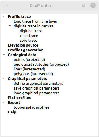
GeoProfiler, porting of qProf to qgSurf

To create geological profiles, one of the available tools for QGIS is qProf. 

qProf is still maintained and features are added, mainly based on user requests and suggestions, but the main development has shifted to qgSurf, via the addition of the GeoProfiler tool, that is a porting of the functionalities of qProf to qgSurf.


GeoProfiler GUI is partially modified with respect to qProf and has a general workflow that surely has to be improved as easy of use but that should be more intuitive than that of qProf.

One of the main features of GeoProfiler is its ability to create parallel profiles, starting from a base one.

The following example illustrates the creation of parallel profiles.

We use a base profile, that corresponds to the blue dotted line in the figure below.


Having defined the base profile (in addition to the source DEM) we define the number and spacing of parallel profiles ('Profiles generation' command):


The tool automatically replicates the base profile 5 times, so that at the end we obtain parallel profiles as in the figure below.


The resulting profiles in plan view, with geological outcrops and fault line intersections, are obtained using the 'Plot profiles' command:


Important: to define and fine-tune the polygon and line intersections graphical parameters, as well to define the figure parameters, you need to find the best ones in the graphical parameters windows by trial-and-error.

Very important: defined polygon intersection will not show up in the profiles until you define their graphical parameters ('Polygon intersections' command in figure below).


Crucial: GeoProfiler has one major limitation, with respect to qProf: it does not handle source data with different CRS. So all input datasets must share the same CRS, say EPSG: 32633, to produce meaningful results.


The version of qgSuf with GeoProfiler included has been submitted to the QGIS plugin repository today (Nov. 27, 2022) and has yet to be approved. 

For the impatient or the curious, it can be downloaded and imported in QGIS as a zip file via the GitLab release (remember to unzip the downloaded file, rename the folder as "qgSurf", zip again with for instance 7Zip and install the plug-in from the new zip file)


Sunday, 16 January 2022

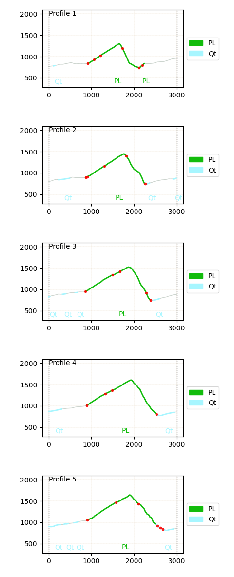
Creating basic geological profile animations

In the new release (v. 6.0.0) of pygsf it is possible to create animations made up of parallel geological profiles.

An example is in the following gif:

The red circles represent fault intersections, while the green thick lines (PL) are Mesozoic carbonatic outcrops and the grey ones (Qt) are Quaternary outcrops. The area is in Southern Apennines (Timpa di San Lorenzo carbonatic structure). The profiles are derived from a geological outcrop shapefile and a topographic DEM, both loaded in a Jupyter notebook using pygsf.


pygsf is a Python module (yet unpublished) for the processing of geological data.

The processing may be performed for instance in a Jupyter notebook.

The plan is to incorporate this module in a QGIS plugin, qgSurf, created for the processing of geological data.


For those interested, the animation derivation is detailed in this Jupyter notebook:

https://gitlab.com/mauroalberti/gsf/-/blob/master/docs/others/Geologic%20profiles%20-%20Timpa%20San%20Lorenzo.ipynb


The version 6.0.0 can be downloaded from:

https://gitlab.com/mauroalberti/gsf/-/tags/v6.0.0


Sunday, 4 June 2017

It's your fault

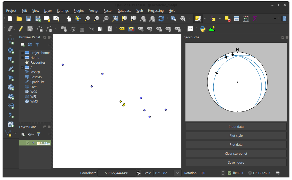
If you want to display your georeferenced faults in stereonets using QGIS you can use also the new functionalities in the geocouche plugin.

It uses apsg by Ondrej Lexa (apsg vers. 0.4.3 is incorporated in the plugin) for plotting geological data in stereonets. It allows to plot normal and reverse faults, while pure transcurrent faults are not explicitly treated in the used apsg version.

Input fault data format can follow two alternative formats:
  1. slickenline dip trend and plunge, plus movement sense ("N" for normal faults and "R" for reverse faults)
  2. rake angle according to the Aki & Richards (1980) convention (see Fig 1).


Fig. 1. Rake angle convention as defined from Aki & Richards (1980). Originally Figure 1 in Alberti (2005).

Take note that if you provide both line trend/plunge/movement sense and rake angle, rake angle takes precedence and shadows the data provided in the trend/plunge/movement sense format.

Now an example of using the geocouche tools for faults, using fault data stored in a point layer (this same layer is provided as a shapefile in the example data folder in the gihub repository).

You define the input data with the "Input data" button.  If you choose a (point) layer as source and there is a selection in the layer, only selected points will be considered.

Fig. 2. Example data with three records selected in a point layer, plus, on the right, the geocouche plugin activated.

 In the "Layer" tab of the input windows, you define the source fields for the different data types. Remember that definining (also) rake would override any data defined in the line orientation trend/plunge/movement sense fields.

Fig. 3. Definition of input fields for record dip direction, dip angle and rake angle.

You define which type of data to plot for the "plot data" button. You could also previously have changed the default plot style via the "Plot style" button.
Here we plot faults with slickenlines. Also T-L diagrams are available.

Fig. 4. Choice of faults with slickenlines data type for stereonet plot.

Et voilà..

Fig. 5. The stereonet of the faults and slickenlines data is displayed on the right.

Clear the stereonet with "Clear stereonet". Obviously you can suporpose multiple plots into a single stereonet.
Save a figure with the tool from "Save figure" button.

To install the plugin, clone the repository or download and extract the zip file from https://github.com/mauroalberti/geocouche/releases in your local QGIS Python plugin folder (for instance: /home/mauro/.qgis2/python/plugins/geocouche) and activate the plugin in the installed section of QGIS "Manage and install plugins" command. 

For any question: alberti.m65 at gmail.com


References


Aki, K., Richards P.G., 1980. quantitative Seismology Theory and Methods. Vol. I, W.H. Freeman and Company, San Francisco, CA,, 557 pp.

Alberti, M., 2005. Apllication of GIS to spatial analysis of mesofault population. Computers & Geosciences, 1249-1259.


Monday, 3 April 2017

Plotting geological attitudes in stereonets using QGIS

A new plugin for QGIS, geocouche, allows to plot geological data attitudes stored in stereonets, using the plotting utilities provided by the apsg module by Ondrej Lexa. Data can be stored in geological layers or entered as text, and plotted as great circles or axis. The current release, as of April, 4th,  is vers. 1.0 and  can be downloaded from: https://github.com/mauroalberti/geocouche/releases

How it works? The following description derives from the tool help. 

With the current geocouche  release, it is possible:
  1. to calculate the angles between planes stored in a layer and a reference plane
  2. to plot data from layers or texts in stereonets
These two tools are available from the QGIS plugin interface.

Fig. 1. geocouche interface.


Geological angles

This tool allows to calculate the angles (as degrees) between a reference plane and the (eventually selected) features in a point layer (Fig. 2).

Fig. 2. Geological angles calculation interface.
It can be applied to determine the degree of misalignement between a reference (for instance, regional) measure and local geological measures.

Definition of parameters

The user has to define the two fields storing the azimuth (dip direction or RHR strike) and the dip angle of each feature, the attitude of the reference plane, and the name of the output shapefile with a new field storing the calculated angle (Fig. 3).

Fig. 3. Definition of parameters for angle calculation.

Geological stereonets

It allows to produce stereonets depicting geological plane and axis attitudes (Fig. 4). There are three steps:
  1. Choice of input data
  2. Definition of plot style
  3. Data plotting

Fig. 4. Stereonet interface.
Choice of input data
It is possible to use input data from data stored in a point layer (Layer tab, Fig. 5) or to use text input (Text tab, Fig. 6).
Input from point layer
When using a point layer (already loaded in the TOC), plane and/or axis attitudes are defined via the fields storing their values (Fig. 5). When a selection is defined, only the selected features will be considered.
Fig. 5. Input from point layer interface.

Input from text
The input can be inserted into a text window (Fig. 6), defining if data consist of:
  • planes
  • axes
  • planes and axes
Fig. 6. Input from text interface.

Another option to take care of, is,  for plane data, whether orientations are expressed using dip direction or RHR strike.
Plot style
Styles can be defined for both great circles and poles: color, width/size, line/marker style, and transparency (Fig. 7). Settings are stored in memory.
Fig. 7. Plot style interface.

Stereonet plotting
Plots can use a new or a pre-existing stereonet (provided it has not been previously closed) (Fig. 8).
Fig. 8. Stereonet plot interface.

Planes can be plotted as great circles or as plane normals, axes as poles or as normal great circles. An example of stereonet is shown in Fig. 9.
Fig. 9. Stereonet example.