Sunday, 5 February 2023

SVD-based inversion of geological surfaces from topographic traces: preliminary assessment of reliability via eigenvalue log ratios


Topographic traces of geological surfaces store information about the surface attitudes. When considering the local scale, in the majority of the cases the surface can be approximated by a geometric plane.

Singular Value Decomposition (SVD) is one of the available methods for inverting the topographic traces, i.e., deriving the local, geological surface planar attitude.

SVD input and output matrices

Input data for the SVD methodology are expressed as an m x n matrix, here named A. When successful, the SVD method produces 3 matrices, named U, S and V* (* means transposed), so that A = U x S x V*. In the general case, U has dimensions m x m, S is an m x n diagonal matrix (i.e., all values are zero except for those on the main diagonal), while V* is an n x n matrix.

Input and output data for topographic point inversion

For topographic points inversions, m, i.e.. the number of matrix rows, is equal to the number of input points while n, the number of matrix columns, is equal to 3, since we are considering a 3D Cartesian space. The U matrix dimensions, i.e., m x m, are equal to the number of input points. S is an m x 3 diagonal matrix, whose main diagonal values stores the eigenvalues in descending magnitude order (s1 >= s2 >= s3).
V* is a 3 x 3 matrix that stores the eigenvectors of the A matrix.
In particular, the last row of the V* matrix, that is associated with the minimum value eigenvalue s3, contains the Cartesian components of the vector that is normal to the potential best-fit-plane.

For our purpose, only V* and S are needed for getting the estimated best-fit-plane (by using the last V* matrix row) and evaluating its reliability (by considering S matrix diagonal values).

What about the results reliability?

Some questions are: how can we be sure that the input points can be approximated by a plane? How can we evaluate how good is the fit between the computed result and the real plane? Can a quantitative metric of the result reliability therefore be defined?

To try to answer these questions, at least in a preliminary way, I've created a few simulations of points with different spatial distributions, in order to invert them and check the degree of concordance between the computed plane-normal eigenvector and the theoretical surface attitude. The eigenvalues has been used to try to infer the degree of result reliability.

To better characterize the eigenvalues, their negative log ratios were calculated:

nlr21 = - log (s2 / s1)
nlr31 = - log (s3 / s1)
nlr32 = - log (s3 / s2)


The negative signs before the log operators are used to avoid dealing with negative values. Since the numerator is always equal or lower than the denominator, the resulting negative log ratios are between 0 (for numerator equal to denominator) to infinity (for numerator equal to zero). Nan results can arise when both numerator and denominator eigenvalues are zero.

Software used for simulations and inversions

Both the simulations and the inversions were performed using the programs in the geoSurfDEM repository (currently available only in the dev branch). The SVD inversions are mainly dealt with using FORTRAN and linked Blas/Lapack libraries. C++ code is wrapped around the inversion FORTRAN routines and takes care of data input and output for both the simulations and the inversions.

Basic simulations

To start with, two very simple cases were considered, in order to get a feeling for the resulting eigenvalue distributions.

For these simple distributions, the specific points were directly written into the input files, as rows of x-y-z values (files in 'geoSurfDEM/test_data/InvertPoints' folder, named 'points_01.csv' to 'points_04.csv'). The different cases were then inverted with the code in the 'geoSurfDEM/InvertPoints' folder, specifically the compiled 'InvertPoints.cpp' program).

Co-planar points

These simulations consider perfectly co-planar points (just 4 for each plane dip subcase), lying in a horizontal (a), vertical (b) or 45°-dipping (c) plane.

Results 

The third eigenvector in the resulting V* matrix is always perfectly normal to the simulated plane. The s1 and s2 eigenvalues are equal or of the same order of magnitude (e.g., s1 = 2 and s2 = 1.41), while the s3 eigenvalue is always zero.
The nlr21 values are between 0 and 0.15 for all three cases (i.e., s1 and s2 equal or almost equal). Both nlr31 and nlr32 indices are infinity (since s3 is zero).
So for co-planar points we expect s1 = s2 >> s3, with nlr12 values around zero and very high values of both nlr31 and nlr32.

Collinear points

Three perfectly collinear, horizontal points were used as input data. Obviously no meaningful best-fit-plane exists.

Results

s1 is 1.4142 while s2 and s3 are both zero. So both nlr21 and nlr31 are infinity while nlr32 is Nan. 

Collinear points produces eigenvalues where s1 >> s2 = s3 and very large values of nlr21 and nlr31. The nlr32 index should be around 0 (apart when s2 and s3 are both zero).

Collinear and co-planar log ratios summary

The current results for the co-planar and collinear cases can be summarized as in the following diagram:

  • co-planar data have very high nlr31 and nlr32 indices. 
  • collinear points have very high nlr31 index and near zero nlr32 index.


Going uniform

When points have no preferred orientation, what are the resulting eigenvalues?

To answer this question, I've created uniform spherical distributions of point. I used a slightly modified C++ code published by Cory Simon in http://corysimon.github.io/articles/uniformdistn-on-sphere/. As before, the code is available in the geoSurfDEM repository (currently only in the dev branch and I have to check that code again since I've made modifications to the FORTRAN inversion routine...).

The simulated data to invert were created as such: 1000 random simulations were generated for 6 set of generated point number: 3, 4, 5, 10, 100 and 1000 points.
The files storing 3 points correspond in general to a unique well-defined inverted plane, apart from the cases where the points tend to collinearity (the case of three coincident points was excluded in the code). 

In the Addendum, all statistical plots for these simulations are presented. Here I show only the most significant plot, that complements the previous results.

When considering the nlr31 vs. nlr32, we see that perfectly co-planar data (n = 3) have high values of both these indices.

Spatially uniform data (simulations with n >> 3) have almost equal eigenvalues, so in the graph they are clustered towards the axes origin.


Conclusions

We can add together all the previous results in this summary sketch:


Where is the exact limit between almost co-planar and random points? And between collinear and co-planar points (undulating blue line)?

Unfortunately these simulations do not give us a quantitative answer. They say us when it is surely random, when surely co-planar or collinear, but further analyses where a quantitative measure of adherence of the empirical data to the theoretical (i.e., planar) model are needed. 

However, prior to applying other models, a check that our data are not random or collinear could help us to avoid producing false-positive results.


Addendum: Statistical properties of spherically uniform random points.

These are all the statistical plots for the spherical simulations.

The plots were generated with R and ggplot2. 

Simulations are subdivided by number of simulated points (from 3 to 1000).

The plots are not commented.


Sunday, 1 January 2023

 To invert the attitude of a geological trace


In 2016 I wrote a small utility in C++ and Fortran, geoSurfDEM, that calculates the intersections of a geological surfaces with a topographic surface (in the module "IntersectDEM", see post "geoSurfDEM: a C++ console application for determining intersections between 3D geological surfaces and topography") and that inverts the attitudes of geological traces (module "BestFitGeoplanes", see post "A Linux tool for calculating local best-fit plane attitudes from geological traces"" for the original description).

Provided a set of points of a geological trace, defined by their coordinates x-y-z, the BestFitGeoplanes module derives the local best-fit-planes, using a mathematical technique known as Singular Value Decomposition (SVD).
The used Fortran Lapack subroutine derives the eigenvectors and eigenvalues of the set of the source points expressed as a matrix (m x 3, where m is the number of points and 3 is the dimension of the embedding space, i.e., a 3D Cartesian space).

The eigenvector normal to the plane with the minimum data variance, i.e., the plane that better approximates the data assuming that they approximately subplanar, is the one in which we are interested.

The question is, how reliable is the result? If my data are collinear, no unique solution exists. The same applies when all the points are approximately coincident.

In the original version, in order to characterize the situations related to spurious results, the module calculated the spatial range of the source data along the three reference axes and also the volume of the bounding box (axes-aligned).

To verify whether they can really provided indications of errors (i.e., large differences between expected and calculated values),  a synthetic data set, made up by two geological traces, was inverted and the results analyzed.
The two synthetic geological traces derive from the analysis of the Timpa di San Lorenzo fault structure (Calabria, Southern Italy), where the northern and the southern fault structure segments attitudes can be approximated by two planes, respectively oriented 067.3°/39° and 077.3°/40° (with respect to the UTM 32632 CRS up direction)(see previous post "Along-trace profiles of the Timpa San Lorenzo fault structure (Calabria, Italy)"). The used DEM is a subset of the TINItaly DEM.

 
The intersection of two theoretical attitudes with the DEM were calculated using the 'DEM-plane intersections' of the qgSurf QGIS plugin, with the results saved as two point shapefiles. Points outside the fault spatial range were removed, the two layers were then merged into a shapefile and the data were exported as an x-y-z csv file, to be used as input for the 'BestFitGeoplanes' module.

The inversion results reproduce the theoretical attitudes very well (< 1° of difference), except for 4 values out of the total 311 (1.3 %). The spatial ranges of the source point data for each result do not appear however to be predictors of the result reliability.

To find a better quality indicator, a new code version outputs the values of the three eigenvalues for each result.
Generally the first eigenvalue (S1) has a value in the 10-50 range, the second (S2) is 1 or less, and the third eigenvalue (S3) is very low or zero.

In the analyzed data set, the "erroneous" results are characterized by low S2 values, around e-5. By considering the logs of the ratio between S2 and S1, the results with values lower than -5 are from grossly (>> 1° misfit) to mildly (1° or less) disoriented (Fig. 3). 
Indices comprised between -3.2 and -5.0 are correlated with mildly disoriented results (< 1° disorientation).


So using a threshold of -3.0 for this data set filters out all the low-quality.

Obviously, to check whether this empirical threshold can be considered general requires to consider other test cases. Possibly a collinearity index, to be defined, could be used an additional or alternative quality indicator.

References


Monday, 26 December 2022

Along-trace profiles of the Timpa San Lorenzo fault structure (Calabria, Italy)


Fig. 1. 3D view of the Timpa di San Lorenzo structure (center) with the Pollino range at the West (left). View from NE, Google Earth maps.


One quite spectacular geological structure in Southern Italy that can be visualized in 3D terrain browsers such as Google Earth is the Timpa di San Lorenzo (TSL) carbonatic structure, outcropping at the border between Basilicata and Calabria near San Lorenzo Bellizzi (Fig. 1).  

If you play for instance with Google Earth, you would note a well exposed, planar fault surface cutting through limestones in the footwall. This fault is dissected by other faults, the main one being a NW-SE high-angle fault. North of it the TSL fault has a WNW-ESE trend, while to the South it is NNW-SSE (Fig. 2).
 
   
Fig. 2. Geological sketch representing the Timpa di San Lorenzo structure (center), subdivided into two segments by a NW-SE trending fault. The Mt. Pollino range is at the West (left).

In Alberti (2019) the two main segments were analyzed with GIS tools, namely the qgSurf plugin for QGIS, in order to derive the best-fitting planes to the various fault segments.
For the northern segment the geological plane fitting the traces has an attitude of 072°/39° (dip direction/dip angle), i.e., a medium-angle fault dipping to the ENE.
In the southern segment the best-fitting plane attitude is 082°/40°, i.e. a 10° trend rotation in a clockwise manner with respect to the northern sector.
 
In order to help visualize these inferred geological planes directly within geological profiles, I am adding in the pygsf and gst Python modules a new GIS tool that uses line traces with attitudes, intersect them with profiles and plot the intersected attitude in the profiles. This tool is still in development.
 
To analyse the geological situation for the studied zone, I used the two previous geological attitudes in order to derive, using the ‘Plane-DEM intersections’ tool of the QGIS  qgSurf plugin, their expected topographic traces. These line traces were clipped to the appropriate spatial domain and then merged together into a single line shapefile.

Using pygsf, gst and spatdata modules in development mode within Jupyter Notebook, the Timpa di San Lorenzo data were imported from the spatdata module, maps with faults (both mapped and theoretical traces) and profiles traces were created (Fig. 3).


Fig. 3. Geological plane traces approximating the Timpa di San Lorenzo structure (yellow lines), with numbered traces of parallel profiles. Profiles from 1 to 7 are of the fault northern segment, from 8 to 13 from the southern one.

The final product is represented by the geological profiles (Fig. 4), always produced within Jupyter Notebook using the three mentioned modules. The produced profiles highlights the carbonatic structures, while the pelagic sediments and meta-sediments units are not mapped.

As you can see in the profiles, the theoretical planes approximate quite well the attitude of the outcropping TSL fault slickensides (profiles 1 to 8, with the exception of profile 3, where the TSL fault is masked by other  units).

In the southern segment, the slickenside is visible mainly in profile 8 and also profile 9.
Moving soutwards, both the fault slickenside and the footwall is more and more eroded, due to the deep incision of the Torrente Raganello (profiles 10-13).

Fig. 4. Parallel profiles of the Timpa di San Lorenzo structure (yellow lines), with fault intersections (red dots), geological outcrops of limestones (PL, green) and the profile trace of the best-fitting geological planes (yellow bars). Profiles from 1 to 7 are of the fault northern segment, from 8 to 13 from the southern one. Additional outcrops are of Quaternary sediments (Qt), Albidona Formation (Al) and Saraceno Formation (Sa).

 
The Jupyter Notebook document used to create these (and more) analyses is available here.
 
To replicate the analysis you have to clone the gsf, gst and spatdata repositories, install the modules (for instance in development mode) and then run the notebook.


References
 
Alberti M. 2019. GIS analysis of geological surfaces orientations: the qgSurf plugin for QGIS. PeerJ Preprints 7:e27694v1 https://doi.org/10.7287/peerj.preprints.27694v1


Saturday, 17 December 2022

GIS evidences for low-angle segments in the Valnerina fault system (Central Apennines, Italy)

A long time ago, my PhD thesis was about the Valnerina line, a Cenozoic structural lineament in the Central Apennines of Italy, that runs parallel to the more important Olevano-Antrodoco line (Fig. 1), that is considered by many Authors to have played an major syn-sedimentary role during the Mesozoic pre-orogenic phase. The Valnerina line was investigated, among others, by Francesco Antonio Decandia (e.g., Decandia 1982), my thesis supervisor in Siena University. 

During the Cenozoic compression phase, both the Valnerina and the Olevano-Antrodoco lines would have been acted as oblique-dextral ramps in the Apenninic thrust-and-fold belt. This role would have derived from the reactivation of syn-sedimentary faults of the Mesozoic Umbrian basin (Decandia, 1982). 

Fig. 1. Map of the described zone. From Fig. 9 in Alberti, 2006.

I remember, in a field trip with students, that Decandia showed us a large fault slickenside between Jurassic Calcari Diasprini/Calcari a Posydonia and Cenozoic Scaglia tectonites in the Schioppo segment of the line. The slickenside was quite high angle, dipping 70° or more to the West (Fig. 2).


Fig. 2. Mesofaults with dextral movements in the footwall of the Schioppo fault. From Alberti, 1998.
 

In the Umbrian sector, the Valnerina line is composed of a few segments, mainly with a NNE-SSW trend. I studied two segments at the North of the Schioppo one, the Tassinare and the Grotti faults (Fig. 3). 


Fig. 3. Traces of Tassinare and Grotti segments of the Valnerina line. From Alberti, 2006.

Studying the slickensides and shear zones exposed along the trace of the Grotti fault, while top-to-NE movements were common, I didn't  find abundant examples of high-angle meso-faults (e.g., Fig. 4, 5).

Fig. 4. The Grotti faults (left) and observed meso-faults at structural stations (right). From Alberti, 2006.


Fig. 5. S-C calcareous mylonites, with calcite shear veins, in a shear zone in the Grotti area. Foto M. Alberti.

At the time, during the first half of '90, I was not aware of GIS tools and related quantitative digital techniques for studying geological surfaces. I just remember, during a stage in Basel University, the geologist Daniel Bernouilli, digitizing a structural surface at the table with the equivalent of a mouse.

Only after the PhD, while working in the Museo dell'Antartide in Siena, I began knowing and working with commercial GIS tools, i.e. ArcView and Arc/Info. Later I began using QGIS, Saga, Grass, i.e, the open source side of the GIS software.

With Python, a scripting language well integrated with QGIS, I started creating plug-ins devoted to structural analysis of geological field data. One of these plug-ins, qgSurf, includes a module, named 'DEM-plane intersection' that allows to calculate the expected intersections between a geological plane and a topography. 

When applying this module to the data of the Grotti fault, I was surprised to find that a very low angle plane (West-dipping and about 7° of dip angle) would approximate in a more than acceptable way the traces of both the Grotti fault and the southern portion of the Tassinare fault, even when considering that the Grotti fault is locally displaced by a few minor NW-SE normal faults  (Fig. 6).

Fig. 6. Map of traces (red lines) of the Grotti (NNE-SSW mean trend, central part) and Tassinare (broadly N-S trending, to the West) faults. The theoretical trace of the inferred geological plane with dip direction 269° and dip angle of 6.7° is superposed (semi-transparent thick orange line).

In Fig. 6 you may note that in the South-Eastern part a large klippe, plus a minor one to the North would be expected. There are no geological evidence of these klippen in the field (cf. Fig. 7), but it could be explained by the fact that the geological surface increases its dip to the South-East.

Fig. 7. Geological sketch of the Tassinare-Grotti zone (from Alberti, 1998).


To represent the inferred attitude of the plane with respect to the geological situation, I have modified the gsf and gst Python modules to allow plotting significant planes into parallel profiles, as visualized in the profiles below. 

The input data are geological outcrops, faults and a DEM of the zone. Analyses and plots were made within a Jupyter Notebook.

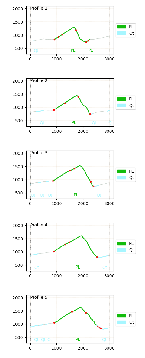
The five parallel lines in the map (Fig. 8, white lines), from North (# 1) to South (# 5), are shown as topographic profiles in Fig. 9, with geological formations (see legend) and fault traces (red dots) added.

The very low-angle geological plane 269°/06.7° is represented in these profiles by the thick semi-transparent orange line. 

It can be seen that it approximates quite well the mapped traces of the NNE-SSW trending Grotti segment. It is therefore possible that the Grotti segment is a low-angle fault, differently from the Schioppo segment of the Valnerina line.

Fig. 8. Topographic map of the studied zone, with fault traces (red lines) and paralell profiles (white lines). Created with gst and gsf Python modules.
Fig. 9. Topographic profiles as in Fig. 8, with geological formations and fault traces (red dots). The low-angle plane is represented by the thick orange line. Created with gst and gsf Python modules.


References

Alberti, M., 1998. Ruolo cinematico e dinamico di lineamenti sisedimentari mesozoici durante la tettogenesi Appenninica - Linea della Valneria, Umbria. Unpublished Phd thesis.

Alberti, M., 2006. Spatial structures in earthquakes and faults: quantifying similarity in simulated stress fields and natural data sets. Journal of Structural Geology, 28, 998–1018.

Decandia F.A., 1982. Geologia dei Monti di Spoleto (Prov. di Perugia). Boll. Soc. Geol. It., 101, 291-315.


Sunday, 27 November 2022

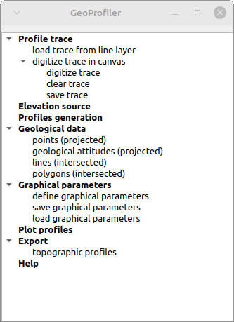
GeoProfiler, porting of qProf to qgSurf

To create geological profiles, one of the available tools for QGIS is qProf. 

qProf is still maintained and features are added, mainly based on user requests and suggestions, but the main development has shifted to qgSurf, via the addition of the GeoProfiler tool, that is a porting of the functionalities of qProf to qgSurf.


GeoProfiler GUI is partially modified with respect to qProf and has a general workflow that surely has to be improved as easy of use but that should be more intuitive than that of qProf.

One of the main features of GeoProfiler is its ability to create parallel profiles, starting from a base one.

The following example illustrates the creation of parallel profiles.

We use a base profile, that corresponds to the blue dotted line in the figure below.


Having defined the base profile (in addition to the source DEM) we define the number and spacing of parallel profiles ('Profiles generation' command):


The tool automatically replicates the base profile 5 times, so that at the end we obtain parallel profiles as in the figure below.


The resulting profiles in plan view, with geological outcrops and fault line intersections, are obtained using the 'Plot profiles' command:


Important: to define and fine-tune the polygon and line intersections graphical parameters, as well to define the figure parameters, you need to find the best ones in the graphical parameters windows by trial-and-error.

Very important: defined polygon intersection will not show up in the profiles until you define their graphical parameters ('Polygon intersections' command in figure below).


Crucial: GeoProfiler has one major limitation, with respect to qProf: it does not handle source data with different CRS. So all input datasets must share the same CRS, say EPSG: 32633, to produce meaningful results.


The version of qgSuf with GeoProfiler included has been submitted to the QGIS plugin repository today (Nov. 27, 2022) and has yet to be approved. 

For the impatient or the curious, it can be downloaded and imported in QGIS as a zip file via the GitLab release (remember to unzip the downloaded file, rename the folder as "qgSurf", zip again with for instance 7Zip and install the plug-in from the new zip file)


Sunday, 6 February 2022

Animations of geological profiles with map traces


In the new 6.2 pygsf release (2022/02/06) it is possible to create figures and also animations that represent a set of parallel profiles in which each geological profile is coupled with the related map trace.


Currently, the produced maps (left in the above animation) can only represent the profile traces, apart from the topography (optionally with a shaded relief). 

The code to create the above animation is available in the Jupyter notebook:

Geologic profiles map animations - the Timpa San Lorenzo structure (Southern Italy)


The release is available here:

https://gitlab.com/mauroalberti/gsf/-/tags/v6.2.0


Sunday, 30 January 2022

Cross-section maps vs. profiles


The new pygsf release (v. 6.1.0) makes it possible to create and visualize directly in Jupyter, just using Python, topographic maps with superposed traces of parallel profiles, numbered by their ids as in the example below.

These map traces can be compared with the topographic vertical profiles displaying also geological information, for instance geological outcrops, that can be composed into an animation.


Next step would be to implement  the creation of animation with both the topographic vertical profile and a map with the corresponding map profile trace, so to make easier to relate each vertical profile with the related map trace.


The map traces and animation creations are detailed in this Jupyter notebook:

https://gitlab.com/mauroalberti/gsf/-/blob/master/docs/others/Geologic%20profiles%20-%20Timpa%20San%20Lorenzo.ipynb


The version 6.1.0 can be downloaded from:

https://gitlab.com/mauroalberti/gsf/-/tags/v6.1.0


Sunday, 16 January 2022

Creating basic geological profile animations

In the new release (v. 6.0.0) of pygsf it is possible to create animations made up of parallel geological profiles.

An example is in the following gif:

The red circles represent fault intersections, while the green thick lines (PL) are Mesozoic carbonatic outcrops and the grey ones (Qt) are Quaternary outcrops. The area is in Southern Apennines (Timpa di San Lorenzo carbonatic structure). The profiles are derived from a geological outcrop shapefile and a topographic DEM, both loaded in a Jupyter notebook using pygsf.


pygsf is a Python module (yet unpublished) for the processing of geological data.

The processing may be performed for instance in a Jupyter notebook.

The plan is to incorporate this module in a QGIS plugin, qgSurf, created for the processing of geological data.


For those interested, the animation derivation is detailed in this Jupyter notebook:

https://gitlab.com/mauroalberti/gsf/-/blob/master/docs/others/Geologic%20profiles%20-%20Timpa%20San%20Lorenzo.ipynb


The version 6.0.0 can be downloaded from:

https://gitlab.com/mauroalberti/gsf/-/tags/v6.0.0


Monday, 16 August 2021

Visualization and analyis of parallel topographic profiles in Jupyter

A new version (5.0.1) of pygsf adds tools for the creation and analysis of parallel profiles, for instance directly into a Jupyter notebook.

What is pygsf? It's a Python module devoted to the processing of topographic and geological data.

With the new tools, multiple profiles can be plotted, as well as their statistical properties: for instance the range of the profiles, their minimum, maximum and mean traces. The profiles can also be exported as a line shapefile, in order to visualize them in a GIS software (e.g. QGIS), or exported as an animated gif. 

The images below represent a brief tour of the methods available.

First is a simple plot of a single topographic profile.

We can create multiple parallel profiles, for instance 5 parallel profiles produced from the base profile using a user-provided normal offset:

The multiple profiles can be plotted into a single graph:


They can be composed into an animation (quite slow to play, I admit):

The minimum and the maximum of the profiles along the trace can be plotted in a single profile:

and also the range (maximum - minimum) calculated and plotted:

Last showed method  is the possibility to save the multiple profiles into a new line shapefile, that can be loaded for instance in QGIS to display the locations of the topographic sections created (the Mt. Alpi zone in the Lucania Southern Apennines, Italy):


The code repository is at:
 
A quite detailed notebook describing how to reproduce the processing shown here is available at:
(note: unfortunately the embedded gif results broken) 


Sunday, 1 October 2017

New release of qProf

qProf is a QGIS plugin for creating topographic and geological profiles.
A new version has been just released at: https://github.com/mauroalberti/qProf
This new version allows to create multiple topographic profiles, when the input profile lines are defined in a source line layer.
An example of a created profile is below.


To download the zipped plugin folder:

https://github.com/mauroalberti/qProf/releases

 Installation instructions are available at the main page:

https://github.com/mauroalberti/qProf

Sunday, 4 June 2017

It's your fault

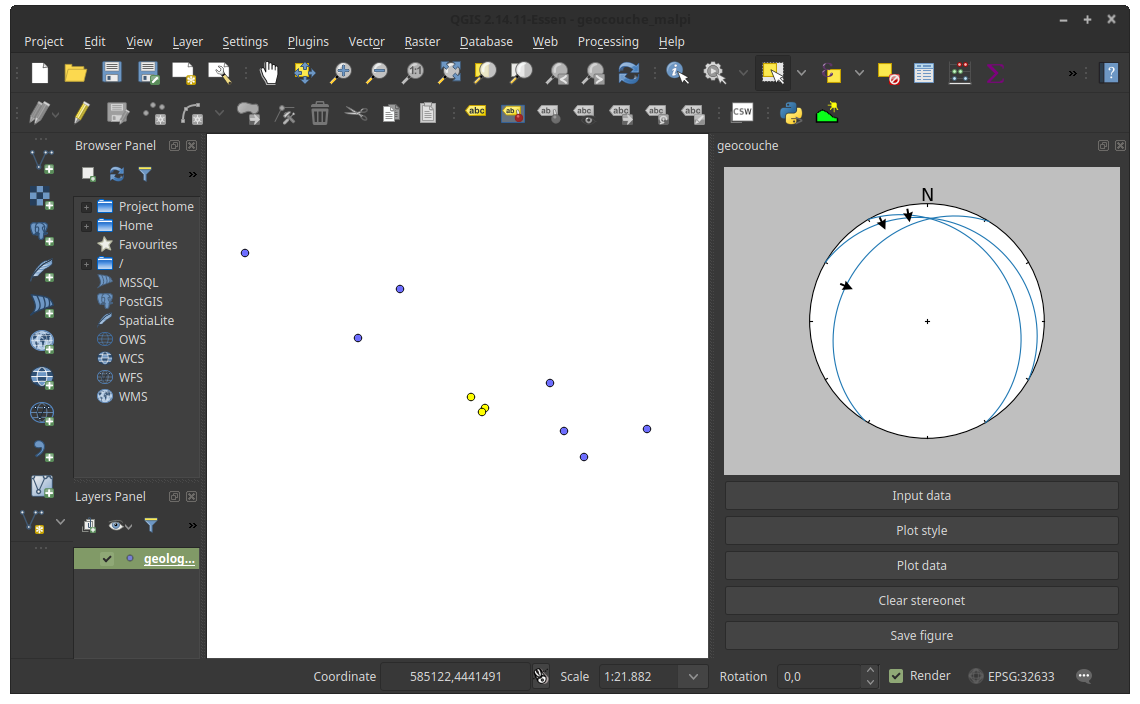
If you want to display your georeferenced faults in stereonets using QGIS you can use also the new functionalities in the geocouche plugin.

It uses apsg by Ondrej Lexa (apsg vers. 0.4.3 is incorporated in the plugin) for plotting geological data in stereonets. It allows to plot normal and reverse faults, while pure transcurrent faults are not explicitly treated in the used apsg version.

Input fault data format can follow two alternative formats:
  1. slickenline dip trend and plunge, plus movement sense ("N" for normal faults and "R" for reverse faults)
  2. rake angle according to the Aki & Richards (1980) convention (see Fig 1).


Fig. 1. Rake angle convention as defined from Aki & Richards (1980). Originally Figure 1 in Alberti (2005).

Take note that if you provide both line trend/plunge/movement sense and rake angle, rake angle takes precedence and shadows the data provided in the trend/plunge/movement sense format.

Now an example of using the geocouche tools for faults, using fault data stored in a point layer (this same layer is provided as a shapefile in the example data folder in the gihub repository).

You define the input data with the "Input data" button.  If you choose a (point) layer as source and there is a selection in the layer, only selected points will be considered.

Fig. 2. Example data with three records selected in a point layer, plus, on the right, the geocouche plugin activated.

 In the "Layer" tab of the input windows, you define the source fields for the different data types. Remember that definining (also) rake would override any data defined in the line orientation trend/plunge/movement sense fields.

Fig. 3. Definition of input fields for record dip direction, dip angle and rake angle.

You define which type of data to plot for the "plot data" button. You could also previously have changed the default plot style via the "Plot style" button.
Here we plot faults with slickenlines. Also T-L diagrams are available.

Fig. 4. Choice of faults with slickenlines data type for stereonet plot.

Et voilà..

Fig. 5. The stereonet of the faults and slickenlines data is displayed on the right.

Clear the stereonet with "Clear stereonet". Obviously you can suporpose multiple plots into a single stereonet.
Save a figure with the tool from "Save figure" button.

To install the plugin, clone the repository or download and extract the zip file from https://github.com/mauroalberti/geocouche/releases in your local QGIS Python plugin folder (for instance: /home/mauro/.qgis2/python/plugins/geocouche) and activate the plugin in the installed section of QGIS "Manage and install plugins" command. 

For any question: alberti.m65 at gmail.com


References


Aki, K., Richards P.G., 1980. quantitative Seismology Theory and Methods. Vol. I, W.H. Freeman and Company, San Francisco, CA,, 557 pp.

Alberti, M., 2005. Apllication of GIS to spatial analysis of mesofault population. Computers & Geosciences, 1249-1259.